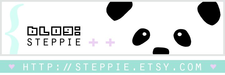
there's something different about my blog.
The banner, the colors, the feel...
it's almost like a whole new place,
but it feels a lot more like home.
My blog's not the only thing that's changed:
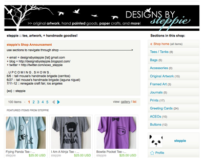
before;

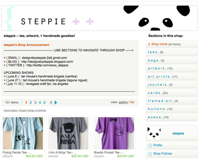
after;

Yup, my shop got a makeover. Take a looksies.
It all started when I began re-taking product photos for my old listings. I really wanted to make my shop look more cohesive, so decided this was a step to do just that. My shop's been open for almost a year now, and it's really evolved with time. I've evolved as an artist with time. So, the idea of having my shop reflect that change and growth I've made with my business and craft only makes sense. Besides, I'm enjoying the clean, fresh look + the great amount of negative space.
Next upgrade to expect:
Be ready for some Panda Face action on yo' Steppie business card.
Please share your feedback + input!
xo,
Steppie
http://steppie.etsy.com
